
The Design Sprint is a five-day process widely used by companies to solve design problems. The whole process is normally run by a user-centered group, however, we do have some occasions when we need to work on our own. And it is actually an efficient way for you to find the solution and then test the prototype in one week.
Overview
As a self-practice with limited time, I decided to conduct my user research on Google Photo via a solo design sprint. The entire process was on a five-day basis. However, due to the re-scheduled date of the usability test with users, it ended up on the seventh day.
Day1. Understand
There are several ways to understand the users’ needs, and what I adopted to reduce the time cost is by collecting the reviews from AppStore. Users who face the problem nowadays normally don’t tend to call the service (unless emergency), instead, they prefer to write a comment anonymously, and this makes them convey their true feelings more at ease.
Define the main problem
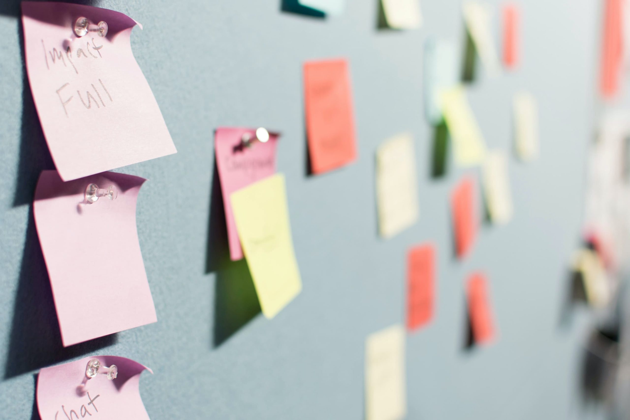
Using the affinity mapping method, I define Google Photo’s main problem as unwanted synchronization while uploading and deleting. Apart from this, I also found that users are not satisfied with the extra charge and the bouncing problem. But with limited time, I will simply focus on our main issue.

Affinity map to categorize relevant themes
Day2. Ideate
To focus on the main problem, I opened up the ideation by asking HMW questions. And this is indeed an effective way to keep you on the right path and innovate ideas at the same time.
HMWs
- How might we let users decide what to upload while maintaining the sync function?
- How might we save the background usage while the sync & backup?
- How might we let users delete specific kinds (e.g. screenshots) of photos all at once?
- How might we let users delete photos on GP while remaining them on phone?
Possible Solutions


Day3. Decide
With the solution in mind, I sketched the storyboard to visualize the concept and predict the possible events when the usability tests take place.

Storyboard of the redesign ideas
Day4. Prototype
In this step, I designed the minimal prototype to illustrate my idea in Figma. And with the high-fidelity screens consistent with Google Photo’s UI system. I created the interactive prototype so users can indeed test the usability on evaluation day.

Day5. Test
To test the prototype, I adopted the A/B test using repeated measures. Every user has to conduct two usability tests: the original one known as system A, and the redesigned one known as system B. The whole test consists of six people, firstly, I introduce them to the scenario and tasks. And during the test, I sit back watching their reaction and taking notes. In the end, I discussed the whole process with them and had a short interview.
")
Imagine that…
“Your phone runs out of storage, and you heard that Google Photo maybe can solve your problem. You download it for the first time and try to upload your travel photos to the cloud. So that you can now free your phone’s storage by deleting the original copy. However, you do not want to upload daily screenshots and personal information to Google Photo.”
Test Results & Feedback
Overall the users found the redesigned version more straightforward and efficient. Compared to the original one, the users were found 2.5 times quicker to finish the task successfully and to their satisfaction. However, one of the users mentioned that he is not sure if a specific kind of photo can be recognized by AI or not, which is valuable feedback to take into consideration.