
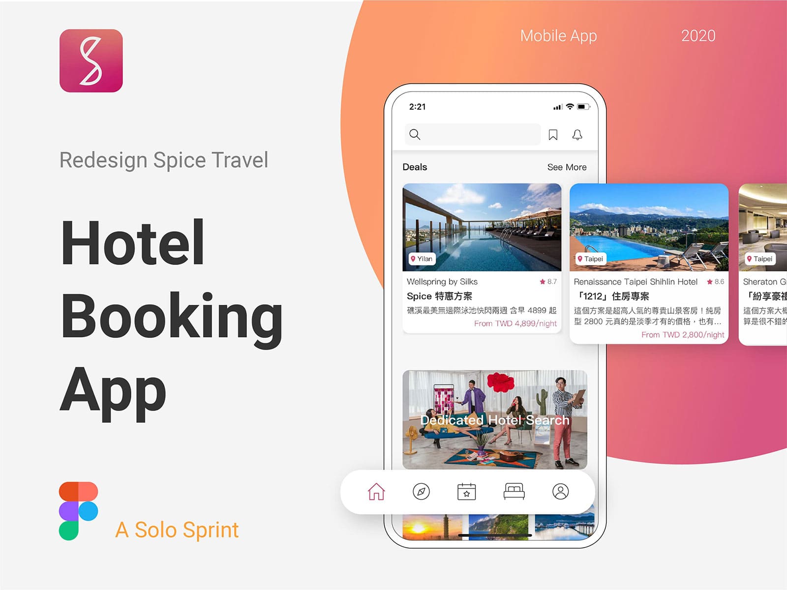
About
The Spice Travel app allows users to easily find attractions through video clips, and plans to add a hotel-booking feature, the same as Spicetravel.com.
My role as the only designer in the team was to conduct a usability test, optimize the whole experience, and create a brand-new vision for the app. In addition, I delivered A/B tests with the team to test the prototype during each revision.

Scope of work
I carefully planned this project as the company hopes to release the new version as soon as possible. Therefore, I made this project a solo sprint with the process below. And the whole project is about 1 month.

Research
Usability Test
To empathize with users and know their existing pain points, I took a usability test with 5 regular users and noted down the observations.


Research
User Journey Map
When users were taking the usability test, I took a video of them and marked down the time they spend on each phase. And after the test, I watched the video with them and asked them how they feel when conducting the test.

Research
Competitive Product Analysis
As the app requires adding the hotel booking feature, I deployed competitive benchmarketing so as to understand the users and their perspectives over the recent booking apps.


I am text block. Click edit button to change this text. Lorem ipsum dolor sit amet, consectetur adipiscing elit. Ut elit tellus, luctus nec ullamcorper mattis, pulvinar dapibus leo.
Ideation
- The new vision should be clean and clarified.
- Keep the hotel searching screen simple and intuitive, with no further information.
- The searching option should include locations, dates, maps, adjustments, and people.
- Add booking-from-vacancy function to the top 10 hotels with the stock-price look.
Visual Style


Final UI Screens
I redesigned the user interfaces to have a fresh, transparent view consistent with the latest trends.

Clean & Categorized
The original home screen contained too much information and had no hierarchy. Therefore, I applied spacing to categorize the information and emphasize the hierarchy by using different card sizes.


Aesthetic and Minimalist Design
On the hotel screen, I created a card design to showcase information. In addition, I used tabs to switch between overview, review, and map, which maintained the minimalist design.

Flexibility and Efficiency of Use
During competitive analysis, we found that most of the booking apps lack the feature of searching available rooms from a particular hotel. And users get depressed when they have to retry different dates.
As a result, we came up with the idea of listing the available rooms of a city’s top 10 hotels, with a look that is quite similar to that of the stock app. Therefore, users can easily check on the available dates by simply swiping left.


Consistency and Standards
The main problem with the original app was a lack of consistency. It contained too many different styles. After determining the main visual, I created a set of icons that satisfied the desired visual style.
Reflection
Learn from Ambiguity
One of the biggest takeaways from this project was gaining experience by swimming through the ambiguity to find something valuable. During the design process, I was quite unsure whether the vacancy finder would be applicable or not. Supported by the stakeholders, I was able to conduct usability tests and discuss it with the programmers. And eventually, my design on the paper became the real function on the app, which brought me more confidence and gave me the aspiration to explore the possibilities of user experience design.