
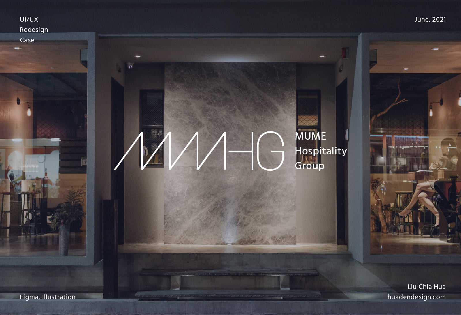
01 About
How can we make a restaurant group’s website more pleasing and delectable?
This restaurant group, MMHG, owns four restaurants, including the Michelin-starred MUME, as well as Le Blanc, Baan, and Coast. However, the group’s website wasn’t as stunning as its restaurants were.
According to a usability test, the original website was unappealing due to its low readability and complex user flow. In addition, although the website contained tons of information it was lacking in organization.
Using the card-sorting method, I redesigned the website’s structure to meet our target users’ needs, and also improved the user experience by assigning a new vision to the website and some interactive animations to give users a refreshing experience.

02 Process
With only 1 month, I led the Agile UX workshops and cooperated intensively with the MMHG team. In the first 2 weeks, I talked a lot with their PR consultant who is in charge of the brand’s marketing. And also run the usability test with the whole team by roleplaying our target users. In the final phase, I conducted the final UI screens and created a prototype for a usability test.


03 Understanding
MUME Hospitality Group (MMHG) is founded in 2020 by Michelin Chef Richie Lin, committing to providing a friendly dining experience and exploring the infinite possibilities behind each dish. At the same time, MMHG also launched its group website hoping to build a deeper bond with people after dining in their restaurants. The website also plays an essential role in marketing and branding.
The Business Goals
Before starting user research, I would like to hear from the business side first. I talked to the team’s PR consultant and restaurant manager who are most relevant to the website and our potential users, they gave me really helpful information and feedbacks which I listed down below.

User Flow (original website)
To understand the website’s overall structure, I created a user flow to analyze the efficiency and errors of the website.

User Flow (original)
04 Research
Primary users -
Customers who want to build deeper connection with us
Based on the Agile UX principle and the limit of time, I decided to create proto-personas and redefine them as the user database grew. I carefully discussed with the project team and read almost every piece of the data report to make sure the proto personas we created could be similar to our target users.
We found that our target users can be categorized into 2 groups. One is customers who want to build deeper connections with MMHG, and another is potential users who are new and want to know more about MMHG. And the latter group just includes investors and partners, which I had discussed with the PR consultant earlier.
Following the rule “design for the primary – accommodate the secondary.”, we decided to recognize customers as our primary users. Because over 50% of the users were from customers who received a business card with the website link on it. And we do want to build a deeper connection with our customers.


Main Persona

Secondary Persona
04 Research
Usability Test
(Role Playing)
")
To understand our users, I separated the team into two groups and gave each of them a persona and a scenario to go through. They have 10 minutes to study the persona and were asked to achieve a certain goal during the process.
After the test, I asked them about their thoughts. It was the most interesting part to me because users usually have unexpected answers. And this is the reason why usability test is so essential.
In addition, I also asked for their individual advice based on their representative of different departments.
User Journey Map

User Journey Map of our Main Users

User Journey Map of our Secondary Users
After conducting the usability tests, I concluded the findings to formulate our user journey maps. I found that both of our target users are not quite satisfied with the visual design and felt disappointed easily when facing unorganized information.
Besides, it’s a new finding that users are not used to the drop-down menu at the navigation. Took the drop-down menu of the restaurant for example, one of our users said that she would prefer to have an overview first than guessing which she might be interested in from the drop-down menu.
04 Research
Card-sorting Method

Card Sorting Results by Best Merge Method
To create a navigation structure that matches the users’ expectations, we adopted the open card sorting research and concluded the findings by Best Merge Method(BMM).
As we can see from the above dendrograms, 56% of the users thought restaurants, charity, collaboration, and shop are highly correlated. And we decided to adopt this classification due to the idea of telling our users what we do in a more distinct way.
05 Ideation
How Might We Statements
How Might We (HMW) questions are always an effective way when it comes to brainstorming ideas. And by writing down the HMWs, it is easier to keep the statements in mind during the design phase.

HMWs
Sitemap

Sitemap
Sketch & Test
Once I gathered all the key information, I explored different possibilities and concepts through sketches. After several refinements, I finally got the whole picture of the website. And I then tested with the original group of users to see whether these solutions meet both the user and business needs.

06 UI Design
Homepage
To make the homepage more attractive, I reorganized the site structure to make it looks more like telling a story about the corporation. In contrast to the original website, I added the “vision” and “collaboration” sections to make the story more complete. And also added some animation to catch the users’ eyes.


Colors and Typography
When designing the main visual style, I decided to minimize the color I used and emphasized the corporate image. As a result, I designed the whole vision based on corporate identity color and used photo materials as complementary colors, such as the marble background on the homepage.

Grid System
Desktop: 1300px

About
According to user research, most of the users would like to know not only the company’s mission but also people and milestones. As a result, I put that information on the same page and added side navigation so users could clearly know what the page is about and find information more easily.


Restaurant
On the restaurant page, I would like my users to have immersive experiences by showing them the restaurant’s exterior look when they hover on the button and bringing them to that restaurant’s section when they click on the button. Besides, I gave each restaurant a block design and highlighted its awards with a background color.


Collaboration
To make the potential partners (one of our target user groups) know better about what MMHG is doing, I suggested adding this collaboration page. Therefore, not only can partners easily understand the cooperation methods, but other users also get deeper insights about the corporate. And below the masonry portfolio section, I put a CTA to the contact page.


Career
On the original career page, there was only job information and the “apply now” CTA. However, job applicants who browse on this site might also want to know the company culture. To do this, I added an introduction about company culture and also employee sharing to give applicants different points of view.